As soon as I read Deb’s comment about Van Gogh that was a great comparison. The softness of your colors throughout the entire painting is wonderful. The white flower just pops right out.
I love the pastel markings over the acrylic. It adds so much interest to the flowers. The contrast of the warm pinks of the flowers and the cool background brings your eye around the painting so well. I am going to try adding pastels to the acrylic.
Beautiful combo of mediums! I was immediately struck by the bold blue backdrop, but as I looked at it I found my eye going in and out of the soft flowers… The blue flowers melting into the blue backdrop and the white flower springing forward from it, give the bouquet an appearance of softly floating in space.
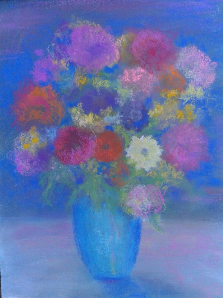
I like the soft feeling of the pastels.
Les
I like the softness too. It reminds me of Van Gogh for some reason. (He’s my favorite)
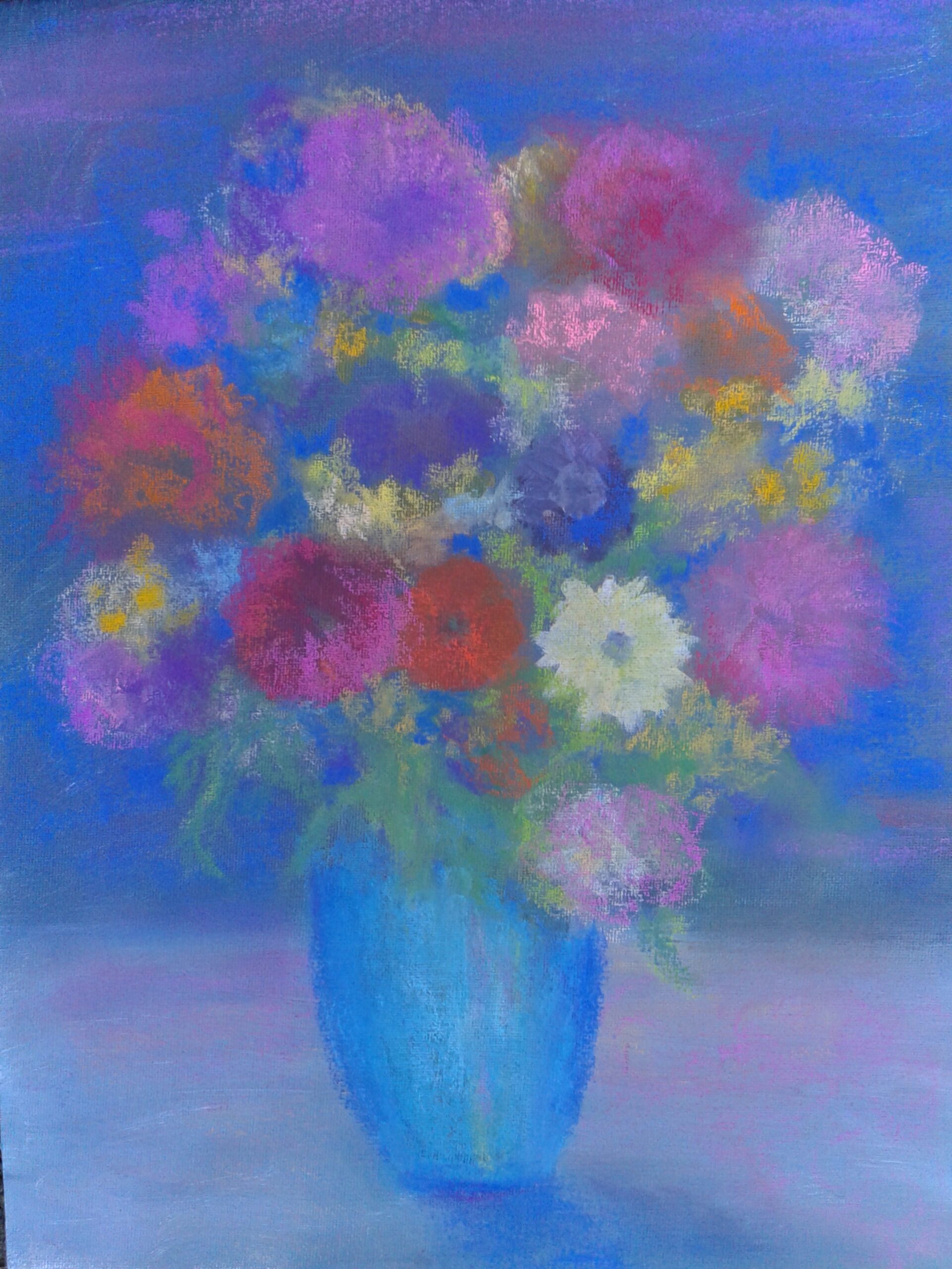
As soon as I read Deb’s comment about Van Gogh that was a great comparison. The softness of your colors throughout the entire painting is wonderful. The white flower just pops right out.
I love the pastel markings over the acrylic. It adds so much interest to the flowers. The contrast of the warm pinks of the flowers and the cool background brings your eye around the painting so well. I am going to try adding pastels to the acrylic.
Beautiful combo of mediums! I was immediately struck by the bold blue backdrop, but as I looked at it I found my eye going in and out of the soft flowers… The blue flowers melting into the blue backdrop and the white flower springing forward from it, give the bouquet an appearance of softly floating in space.