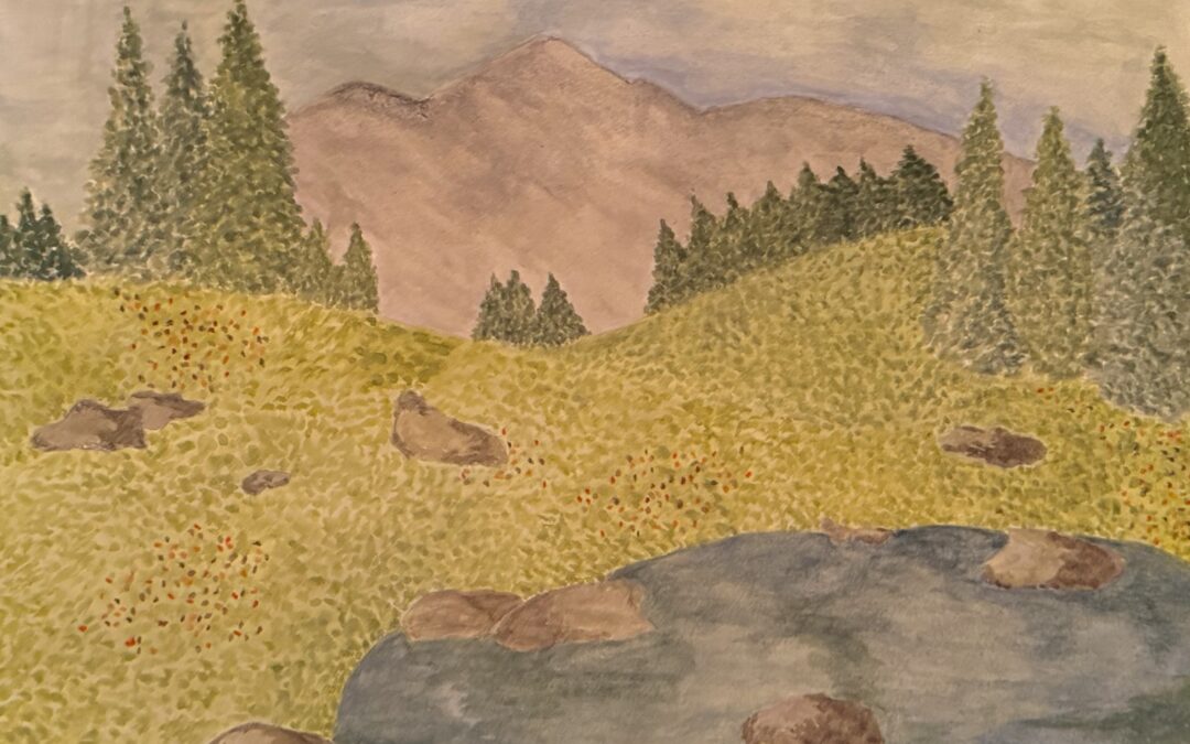
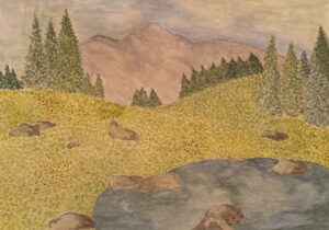
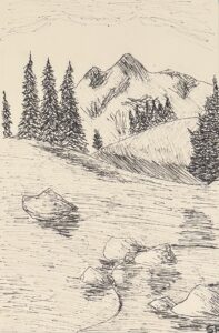
1. For this week, I chose to approach my inspiration from a landscape orientation and adjust accordingly. This time, I felt it was more dimensional and the background of the painting fell back more than last week, which I think I improved on. I also chose to do a pen sketch instead, which made my drawing choices more deliberate and exaggerated, helping the development of my painting.
2.
Well done! It looks like your choice of a pen sketch worked well for you. I can clearly see the curved design lines and my eye follows your dark pattern as it weaves through your drawing. I agree, your painting has depth this week. My eye starts at that dark rock and follows your scattered rocks and trees through the painting and up and over the hill.
I also like the light value you gave the distant mountains, further pushing them into the distance. Beautiful!
I really like your drawing and your painting. The thing I notice the most is the texture in your trees. They look thick and lovely. To me, they seem to be sentinels guarding the entrance to the mountain.
They’re both very well done. I particularly like the mountains in the first and the foreground in your sketch. Very nicely done.
You have a wonderful sense of design, color and texture. The painting is so pretty, enhanced by the way you’ve handled the trees and field.
I really like your drawing and the strong values, it has nice depth which is carried into the painting.
Les