

1.
Since I’m working with gouache, I started with my fav watercolorists, adding in gouache as needed. I’m already realizing the difference from transparent watercolor. It’s great to adjust your values, but not for beautiful transparent paint. These 2 are the only ones I dare to show!
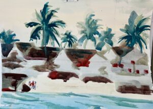
2,
Love the palm trees. The clean design in the second one is beautiful. Transparent or opaque, they’re lovely.
You have taken me to the Islands right now. I can feel the warm breeze in the trees in the first pic and like Deb I’m drawn to how you treated the houses in #2.
Welcome to gouache! I like the contrast you were able to get, transparent against opaque. I am particularly taken by #2. The transparent turquoise with opaque whites really makes the water move. Beautiful!
Rose, I’’’m a little confused…are you using both watercolor and qouache? Good for you to shake it up a bit!
I could only bring up #2. I love the placement of the shapes against the white background. They each seem to tell a story about life on an island. The colors are fresh and beautiful.
I can only bring up #2 also.
Going from transparent to opaque is quite a different feeling!!! Good experiment!
Les
I could only bring up #2 also.
Going from all transparent is quite a different feeling. Good experiment.
Les