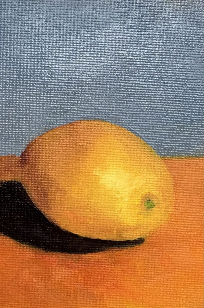
This week we did a still life study of a lemon. 🍋
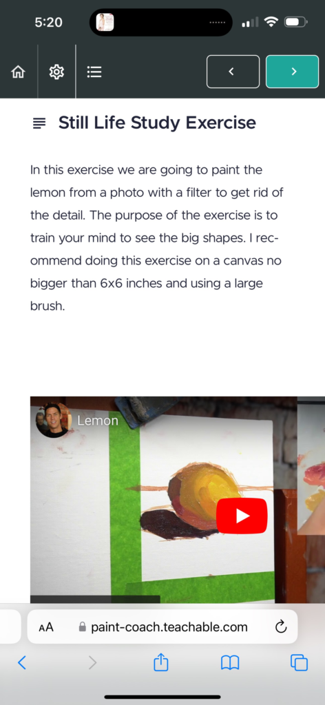
Photo one is my lemon (I think I bended too much?). The second photo has the purpose of our assignment. I’m always surprised when the instructor mixes up colors I would not have thought of using. For example dark purple and mostly orange was used to make this lemon. I’m not sure how I would figure that out on my own.


Wow, that lemon really is right in your face, good exercise.
Les
This is excellent! Whether you blend or not is really up to you and what you like. I like what you did!
I agree with deb. It’s all about what you are trying to express . Take what you want from each class and make your own marks! I love to see your progress.
Beautiful bold color and strong shapes in this. I agree with the above…. It’s great to study others… there is so much to learn for all of us. You will find as you move along, there are things you will keep and emphasize and others that don’t resonate. It sounds like you are really thinking and evaluating as you move along. Bravo!
I love it! The bold colors and design are wonderful.
I think you’re doing it right. Getting some good instruction and deciding what you do or do not like as you go along. If you’re not sure about blending too much, just try doing it again with less, and see what you like. It’s a journey and you’re on it!