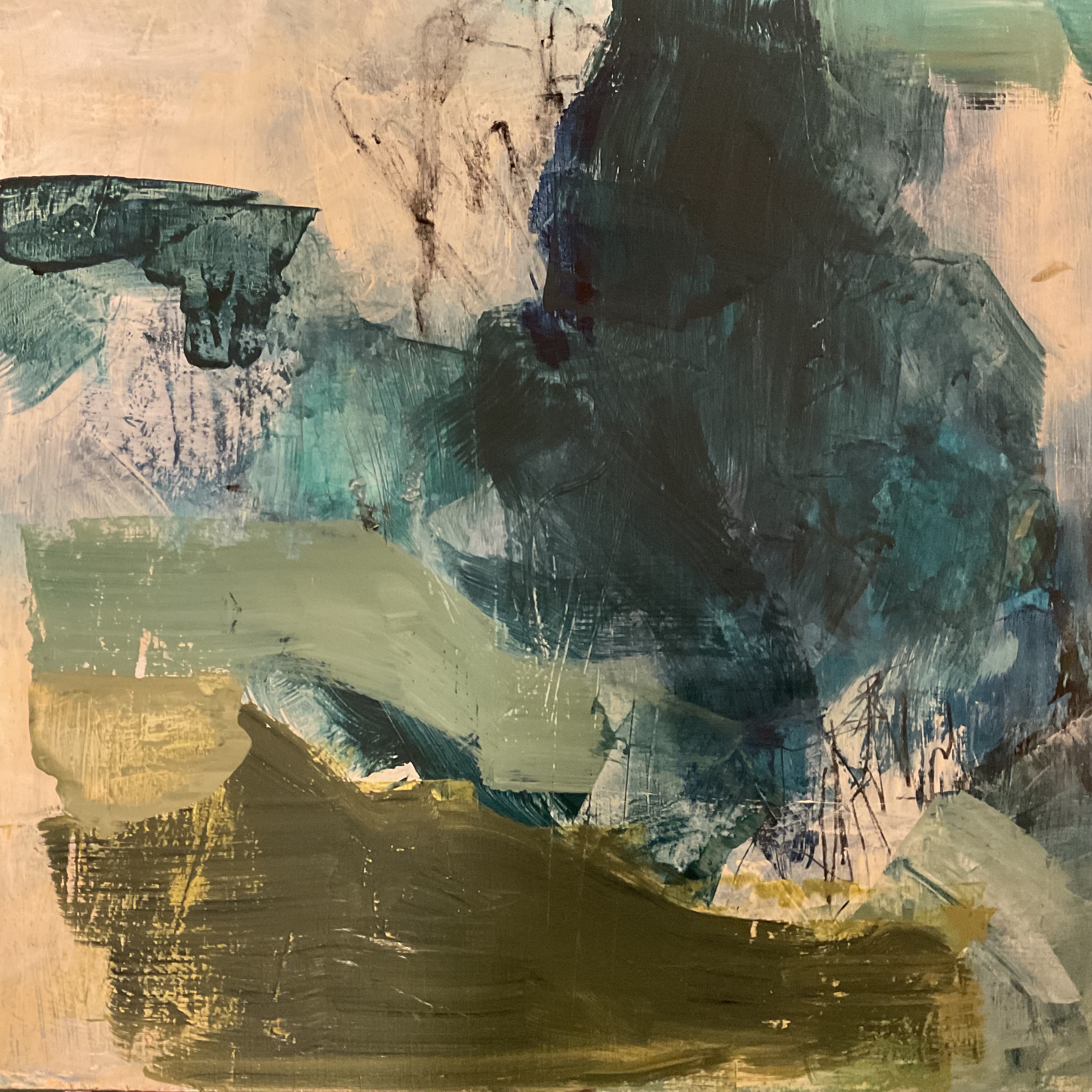
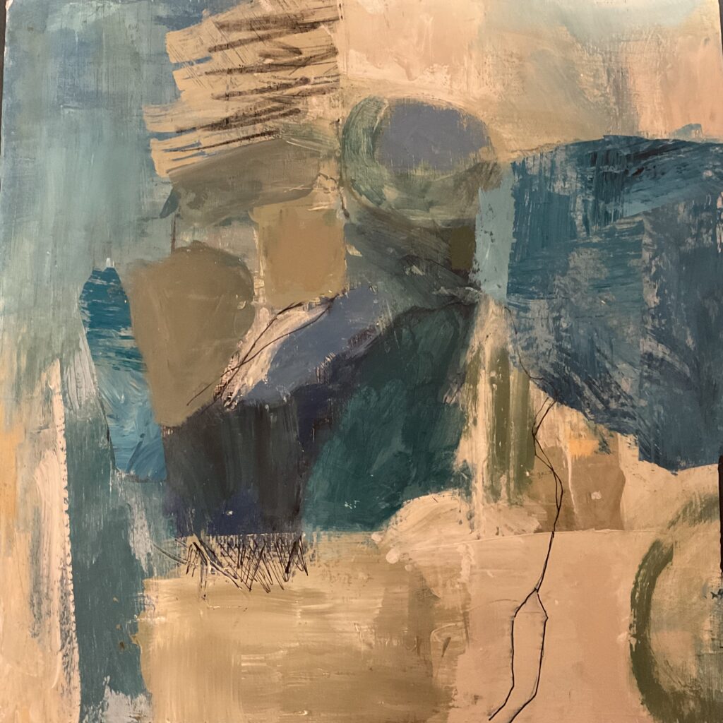
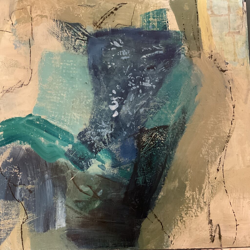
#1 I am pleased with these. I’m calling them “vessels”. I really like #1…not sure about the green horizontal stroke in #3. Would like advice: I used a very limited palette which is easier for me.#2#3
6 Comments
Les
on February 6, 2024 at 3:04 pm
I really like #1 also. I’m not sure about the green horizontal in #3, when I take it out it feels like something needs to be there I’m wondering if it was not quite as heavy because it does lead the eye into the painting.
I agree with les, it does bring you right in and love the color. Perhaps if just a touch of the color was repeated somewhere else (???)these are great compositions and limited palette really seems to work for you
I like the direction you’ve taken, and it’s nice to see you happy with how your work is going. I especially like number 2. The scratch marks and delicate lines drew my attention right away. I like the vertical band of green paint and the small irregular line at the left where the blue and brown meet. I think you’ve got something for everyone here!
These are so interesting to look at Shar. I love the variety of mark making and texture. I particularly love the strength and colors in # 3. Since people are weighing in on the green horizontal stroke, I will too, I would keep it! It looks like it tucks behind part of your center of interest giving it depth. I can visualize it peaking out again at the very bottom on the right side of that large vertical piece and going off the canvas.
I could look at these all day they are so beautiful and interesting Sharon. I love the color palette you chose. Personally I do like the green horizontal stroke in #3. They all give me a sense of strength and peacefulness. I wish I could watch you paint. You are so talented!

I really like #1 also. I’m not sure about the green horizontal in #3, when I take it out it feels like something needs to be there I’m wondering if it was not quite as heavy because it does lead the eye into the painting.
I agree with les, it does bring you right in and love the color. Perhaps if just a touch of the color was repeated somewhere else (???)these are great compositions and limited palette really seems to work for you
I like the direction you’ve taken, and it’s nice to see you happy with how your work is going. I especially like number 2. The scratch marks and delicate lines drew my attention right away. I like the vertical band of green paint and the small irregular line at the left where the blue and brown meet. I think you’ve got something for everyone here!
These are so interesting to look at Shar. I love the variety of mark making and texture. I particularly love the strength and colors in # 3. Since people are weighing in on the green horizontal stroke, I will too, I would keep it! It looks like it tucks behind part of your center of interest giving it depth. I can visualize it peaking out again at the very bottom on the right side of that large vertical piece and going off the canvas.
I love 2. It has a delicate, butterfly sort of quality. And 3 looks like a peson sitting in a recliner with their legs stretched out! Looks cool!
I could look at these all day they are so beautiful and interesting Sharon. I love the color palette you chose. Personally I do like the green horizontal stroke in #3. They all give me a sense of strength and peacefulness. I wish I could watch you paint. You are so talented!