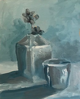

I think I missed one of the goals here. I mixed the gray with Thalo and cad red light, then adjusted for value. If I had done each value with more of one color I could have achieved warm and cool better, but I thought of that later. Oh well…. Scroll down for the original.
I never even thought about warm and cool!!!! Good thought.
Les
You mixed some beautiful grays!
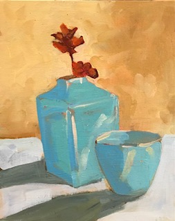
Your value study is so rich and beautiful! I love the color one, as well.
I agree, your grays are beautiful. I also see beautiful patterns in the grays, that I didn’t notice in the color version. I think your “value” painting makes a sensitive and interesting stand alone that has a mood of it’s own.