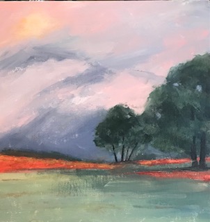
I didn’t like my “lollipop” trees on the original. The second one I changed a lot, ended up not liking the mountain in background, but liked most of the rest of it better.
7 Comments
Adrienne
on March 18, 2023 at 8:12 am
Deb, I think you critiqued it best when you said “lollipop trees.” The shapes and trunks of your re-do have so much more of a loose & natural feel. Also the colors you added to the sky and change of the ground have added do much life to this picture. Very nice.
The redo has so much life to it. The sky is fabulous and the trees are much more believable. The reddish ground pieces really make your eye travel through the painting, too.
Wow… To be honest, I really like both of these. I can’t choose. Your original is stylized…graphic and has great design pieces and rich colors. I happen to love your trees. I like the dark color and value, the design of the negative spaces in your trunks and the round but subtle shifts in their shapes. To me it has a very calming feeling.
The second picture has a markedly different approach. The color combo as well as the soft sun coming through the wispy blowing clouds is unusual and interesting. The glowing orange at the horizon against the blue green arrive at the same serene feeling for me, but In a very different way than the first.
I really like the composition of the redo. The trees lead you into the painting,. I also think the colors in the foreground are soft and beautiful. Of course the grass is my favorite color so I may be prejudiced. The redo seems to have a nice combination of softness and strength.
I like them both, as well. There is something so peaceful and ordered about the original. I’m drawn to the mountains in the second, that actually reminds me of powerful clouds rolling across the sky with it’s sun peaking through.


Deb, I think you critiqued it best when you said “lollipop trees.” The shapes and trunks of your re-do have so much more of a loose & natural feel. Also the colors you added to the sky and change of the ground have added do much life to this picture. Very nice.
Correction of a misspell. “SO” much life to this picture.
I like the feeling of the sun breaking through and soft edges.
Les
The redo has so much life to it. The sky is fabulous and the trees are much more believable. The reddish ground pieces really make your eye travel through the painting, too.
Wow… To be honest, I really like both of these. I can’t choose. Your original is stylized…graphic and has great design pieces and rich colors. I happen to love your trees. I like the dark color and value, the design of the negative spaces in your trunks and the round but subtle shifts in their shapes. To me it has a very calming feeling.
The second picture has a markedly different approach. The color combo as well as the soft sun coming through the wispy blowing clouds is unusual and interesting. The glowing orange at the horizon against the blue green arrive at the same serene feeling for me, but In a very different way than the first.
I really like the composition of the redo. The trees lead you into the painting,. I also think the colors in the foreground are soft and beautiful. Of course the grass is my favorite color so I may be prejudiced. The redo seems to have a nice combination of softness and strength.
I like them both, as well. There is something so peaceful and ordered about the original. I’m drawn to the mountains in the second, that actually reminds me of powerful clouds rolling across the sky with it’s sun peaking through.