
More leaves…the card at top left is from a color cube. I used only those colors, regardless of what the color actually was. Left is Bradford pear leaves. Right is thorny olive.
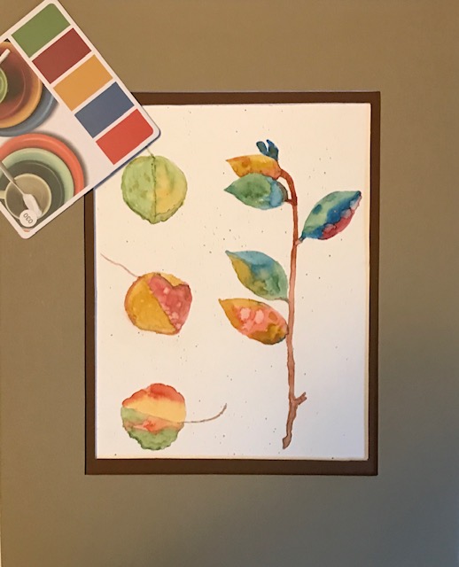
More leaves…the card at top left is from a color cube. I used only those colors, regardless of what the color actually was. Left is Bradford pear leaves. Right is thorny olive.
I like this palette. These colors feel bright and cheerful. A happy feeling painting.
Les
I’m really liking this palette, soft like nature, but better! Like Les said, happy!
Looks like you made full use of all the colors in your palette. The color combinations and mixing is terrific.
Beautiful colors together… They mingle and play off each other really well. Great exercise, and probably could be very useful in figuring out interesting color, when there isn’t any to look at.
What is a color cube? I need to google. What a great exercise! Looks like you have used all the colors beautifully. I can imagine how they would feel picking them up on a fall day. So pretty!