So cool Deb! The lettering, and highlights against the purples and golds, I love what looks like mesh. Those circles draw me in and the title is great!
Great title and I really like this painting. This seems more an abstraction than an abstract. Your verticals and diagonals give me a sense of the city without spelling it out. Your many textures and marks are so creative and interesting. The use of the circles…so wonderful. One could wander through this a long time.
I like this a lot! You are doing so much with collage. The complexity of the purple piece is intriguing as is the “grunge” brown background. I can’t tell where collage and paint stop and start!
Are your backgrounds with all their complexity done with several layers of monoprinting? You’ve inspired me to get out my gel plate and start figuring out how to use it! You have a lot of interest going on and it all blends so beautifully!
Good questions. I usually start with one piece I want to be the focus and put down background papers that will support it. Most of the papers here are
gelli prints, except for the bottom right corner, which is a watercolor piece. After that it evolves putting down areas to soften an edge, create balance in the design, add interest. I made tons of papers doing Catherine’s class twice, and kept the roll off sheets from cleaning the brayer. I also bought some paper-like the wallpaper samples and a few others. I really enjoy making these because you can usually change a section you don’t like just by putting something over it.
lynda
on March 4, 2024 at 12:34 pm
I feel the busyness of the city, with the round traffic lights, the many sights and sounds. But what captured my attention is the feathery white area in the middle which is soft and delicate.
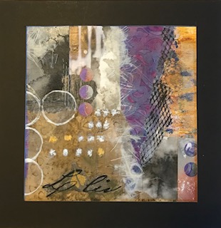

Interesting title! The shades of purple really pull me in.
Les
You have really gone so far with your collage over the past few months. I’m feeling the urban setting.
So cool Deb! The lettering, and highlights against the purples and golds, I love what looks like mesh. Those circles draw me in and the title is great!
Great title and I really like this painting. This seems more an abstraction than an abstract. Your verticals and diagonals give me a sense of the city without spelling it out. Your many textures and marks are so creative and interesting. The use of the circles…so wonderful. One could wander through this a long time.
I like this a lot! You are doing so much with collage. The complexity of the purple piece is intriguing as is the “grunge” brown background. I can’t tell where collage and paint stop and start!
Are your backgrounds with all their complexity done with several layers of monoprinting? You’ve inspired me to get out my gel plate and start figuring out how to use it! You have a lot of interest going on and it all blends so beautifully!
Good questions. I usually start with one piece I want to be the focus and put down background papers that will support it. Most of the papers here are
gelli prints, except for the bottom right corner, which is a watercolor piece. After that it evolves putting down areas to soften an edge, create balance in the design, add interest. I made tons of papers doing Catherine’s class twice, and kept the roll off sheets from cleaning the brayer. I also bought some paper-like the wallpaper samples and a few others. I really enjoy making these because you can usually change a section you don’t like just by putting something over it.
I feel the busyness of the city, with the round traffic lights, the many sights and sounds. But what captured my attention is the feathery white area in the middle which is soft and delicate.