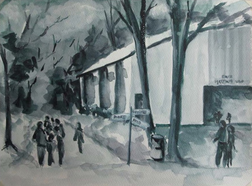

This became an interesting challenge. What to do? Basically I did a value study (not even sure why this painting). Then I realized it lacked something, context, it was painted at a Fair (how could you tell?) I decided to put in a few signs! May add more. Scroll Down.
I like the signs. Also you darkened the value of the trees in the back that keep my eye with the people
Looks like Durham to me. I really like the strong values in the new version.
I think getting rid of the tree on the right, by the people on the left, simplified that area so my eye gets more involved with the people. Signs are a nice touch! I’m not exactly sure why, but the building seems larger as well, adding to the Fair concept. Maybe it’s because there is no line on the roof. Not sure… In any case it works. I love the vigor of the painting and would love to see a larger version!
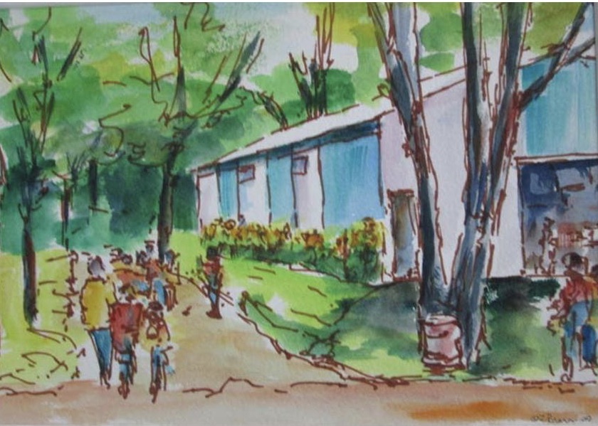
The painting really flows! The people are just wonderful, so interactive!