The original I thought got too literal with the food and kitchen details.. The kids were pretty hard edged and seemed to me kind of static. In the original, I tried to interject energy with a lot of bright colors.
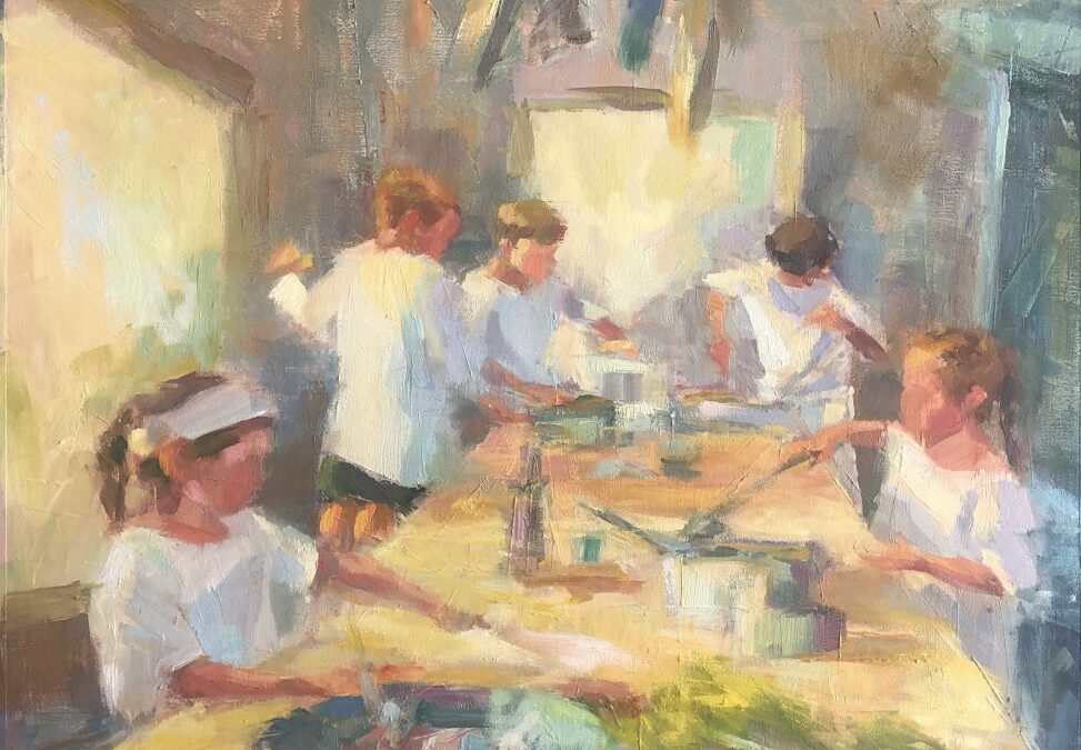
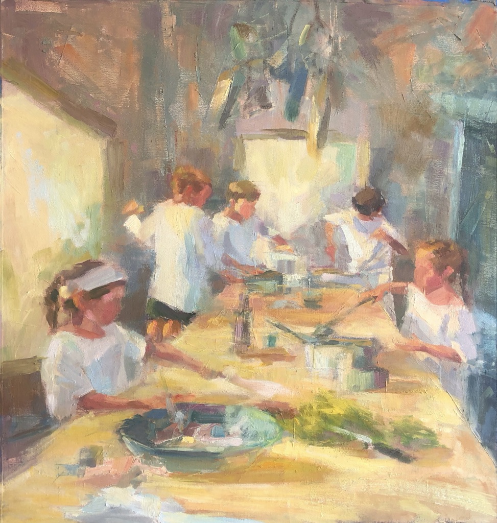
In the redo I decided to eliminate the unnecessary, keep the table “stuff” more suggestive, and try to express the energy by making the painting high key. I wanted to keep the focus on the cooks. I switched to a square format.
Did it work? Dunno. They’re very different. What do you think?
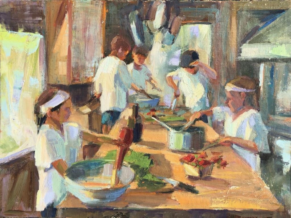
Original
For me, the re-do is much cleaner/clearer to look at. Brighter colors, more detail in the background. I’m feeling the action more
The redo feels so much more active and fluid as I look at it I feel like it’s moving. The original feels more like a photo with a “stop movement” pose.
Les
I like both of them. I kind of like hard edges and bright colors. On the other hand, the softer one looks like you caught them in motion, and there is more focus on the children.
They are both great fun, but the redo gives the energy and focus that the original just misses. The redo shows the flurry of activity without highlighting what they are busy doing.
You really captured the gesture and concentration of your grandchildren in the redo. They were working hard! There is so much energy and movement in it. I also like the loose brush strokes throughout, but especially in the background and the ceiling. I do like the contrast of values and color in the original as well.
Thank you for posting my original this morning. It makes more sense now.
I was drawn to the loose brushstrokes, as well, which is a projection of the little one’s activity! The movement of their arms is incredible, and I can feel their focus and intensity. Such a wonderful memory.