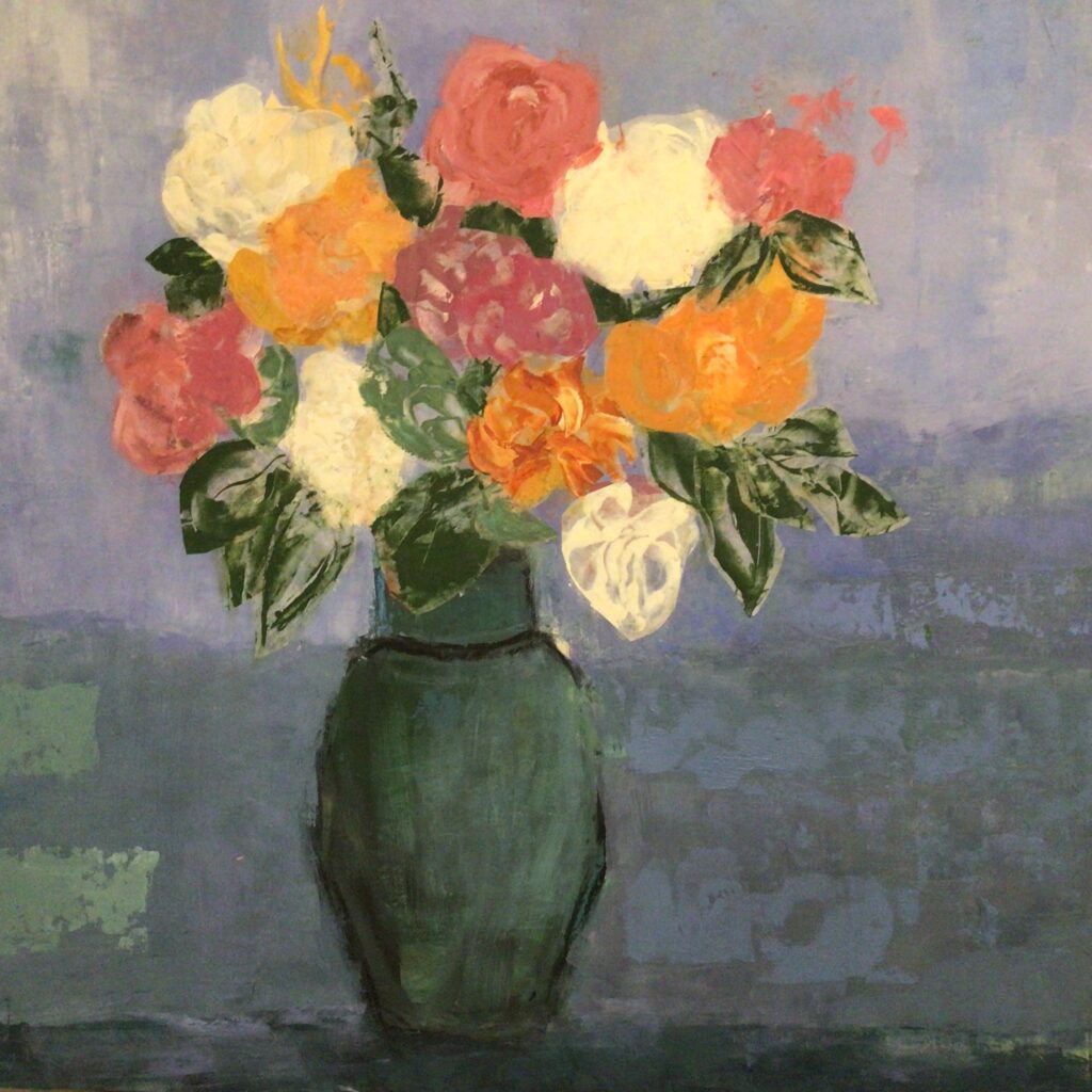
This is stage two of the big one. I first put the flowers in with paint to place them and then went over with handmade collage. I now want to go in with paint again over the collage to loosen it up and hopefully get some more interesting colors. The light paper of the collage will all be painted over. I’m not sure about the background. I liked it at first but it has faded and lost color. I’m also not sure what to do with vase. I welcome any suggestions on any of it. It’s a lot more hard edged and realistic than I was hoping for, but I didn’t trust myself to just paint the whole thing because I knew there would be a lot of wiping out…there still may bear, but at least I have some bones there.
7 Comments
Deb
on December 2, 2022 at 3:31 pm
It’s a beautiful design. It’s hard to suggest changes when it’s in progress. About the only thing I can think of is to bring some flower color down to the bottom of the painting, but you don’t have the final color in, so that may not be helpful. I look forward to seeing what you do with it.
I don’t see anything more to do. I turned it to grayscale and all the values are spot on. Looked at it in the mirror and the design is lovely. I think the simple vase supports the flowers and doesn’t detract.
I love your introduction of collage and the colors you’ve woven in the flowers. Beautiful! The only thing I can throw out to consider is an alternate way to loosen up the feel of the flowers. Right now you have three very symmetrical shapes. The bell of the vase, the rectangle of the throat of the vase and the horizontal oval for the shape of the bouquet. Consider, breaking out of the symmetry of the bouquet in some way to give it more of the looseness you’re after. It wouldn’t take much. Without touching the flowers you might do some paper cutouts of the bouquet shape to see if one of them resonates to you. Just a thought…
Thanks, Sue…I’ve had such a hard time with this. I want it to be loose and have energy and look like it just happened! Ugh!!! I used the collage more for ;placement and have taken a lot of the papers off already. I really haven’t worked on the flowers yet. I don’t look at anything so I’m not that imaginative with the shapes…will keep working on it. I’m now doing a different background, but not sure where its going. I just want it to be loose and abstracted and interesting to look at. Not easy!
I agree with Les. It’s really lovely. it sort of reminds me of Chagall’s work. The one thing that stands out for me, however, is the ‘horizon’ space on the left, lower than the other side (of the flowers). Hope that makes sense.
It’s a beautiful design. It’s hard to suggest changes when it’s in progress. About the only thing I can think of is to bring some flower color down to the bottom of the painting, but you don’t have the final color in, so that may not be helpful. I look forward to seeing what you do with it.
Not sure what you’re looking for but I like the feeling of it as is. The flowers pop and the background is very interesting in a subtle way.
Les
I also am not sure of what this entails but I am enjoying what you’ve done so far.
I don’t see anything more to do. I turned it to grayscale and all the values are spot on. Looked at it in the mirror and the design is lovely. I think the simple vase supports the flowers and doesn’t detract.
I love your introduction of collage and the colors you’ve woven in the flowers. Beautiful! The only thing I can throw out to consider is an alternate way to loosen up the feel of the flowers. Right now you have three very symmetrical shapes. The bell of the vase, the rectangle of the throat of the vase and the horizontal oval for the shape of the bouquet. Consider, breaking out of the symmetry of the bouquet in some way to give it more of the looseness you’re after. It wouldn’t take much. Without touching the flowers you might do some paper cutouts of the bouquet shape to see if one of them resonates to you. Just a thought…
Thanks, Sue…I’ve had such a hard time with this. I want it to be loose and have energy and look like it just happened! Ugh!!! I used the collage more for ;placement and have taken a lot of the papers off already. I really haven’t worked on the flowers yet. I don’t look at anything so I’m not that imaginative with the shapes…will keep working on it. I’m now doing a different background, but not sure where its going. I just want it to be loose and abstracted and interesting to look at. Not easy!
I agree with Les. It’s really lovely. it sort of reminds me of Chagall’s work. The one thing that stands out for me, however, is the ‘horizon’ space on the left, lower than the other side (of the flowers). Hope that makes sense.